tipsy tabletop
case study
Tipsy Tabletop was created with the intention of pairing tabletop games and drinking, in a fun way. I felt if I could merge the two and give the magazine a clean and unique style that game nights would become more intriguing to the everyday person. With this design I created a 24 page magazine with hand-drawn illustrations.
research/design
Now we could move to the design of the magazine, what feel did we want for it to have? Something clean and elegant but with the illustrative elements of board-games and Dungeons & Dragons. I created a Pinterest board with images used for inspiration, chose a color palette, and got to work designing.
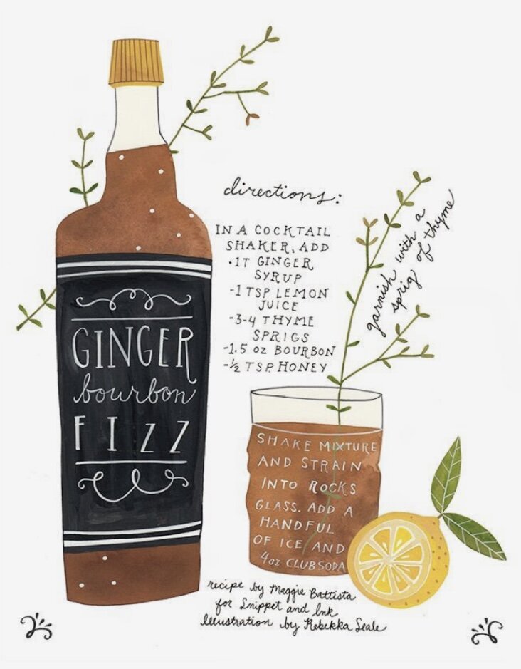
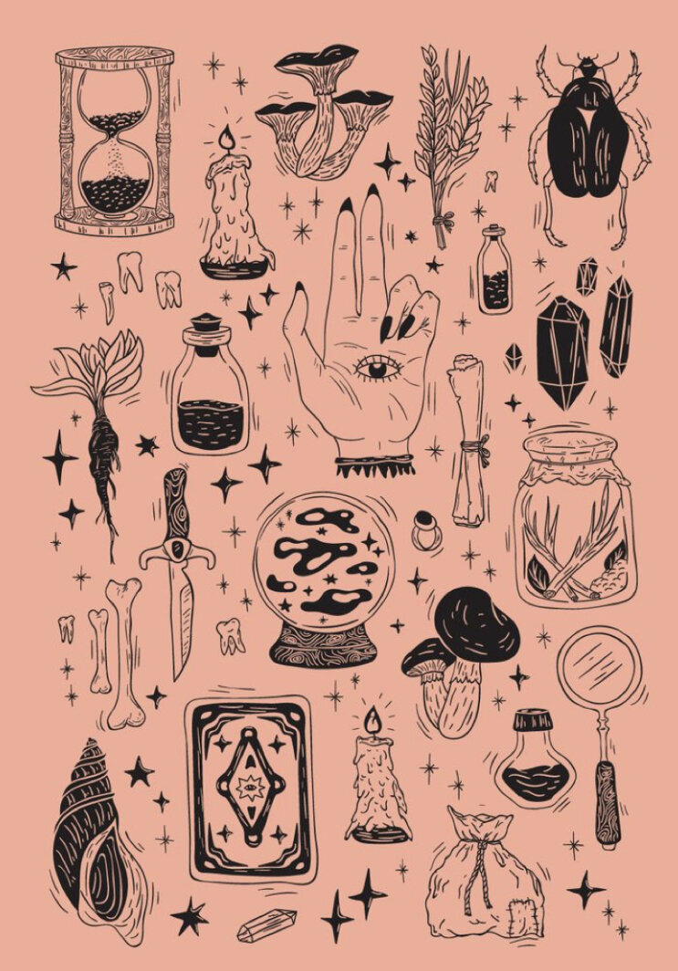
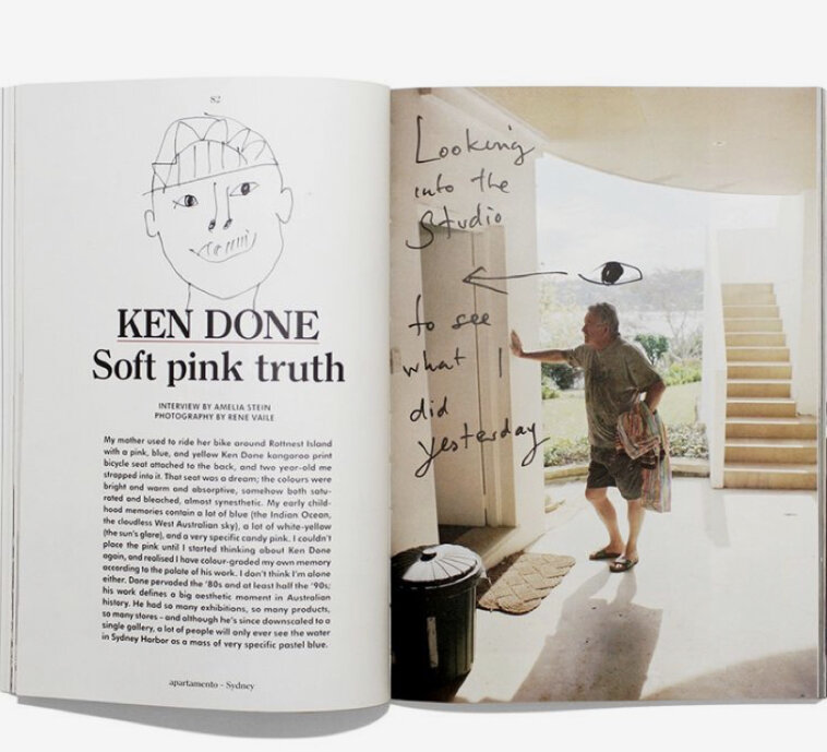


brainstorming:
I started with several ideas, ranging from the arts to gaming. I had finally come up with an idea that combined both! Tabletop games are known for their beautiful illustrations so I decided to focus on those for my magazine. I just had to decide how to make board-games interesting to the everyday person. Once I gathered my thoughts and the games that are featured (D&D, Betrayal, Catan, etc.) I thought of the idea of board-game nights with friends! My roomies and I have game nights and we always need new drink pairings for our games, and thus was born TipsyTabletop, a magazine filled with boardgames and their perfect drink pairings.
analysis:
Once I had a set inspiration for the magazine I went through and gathered all of my articles and retyped them so that they were able to be copy and pasted without hassle. I made a flow chart of words that would work for my cover so that I could have ideas for imagery. My next move was to begin the sketching process for a logo and front cover. I had several ideas, arms loaded with papers filled with sketches, and a brain flowing with imagination.
ideation:
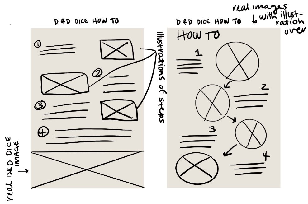
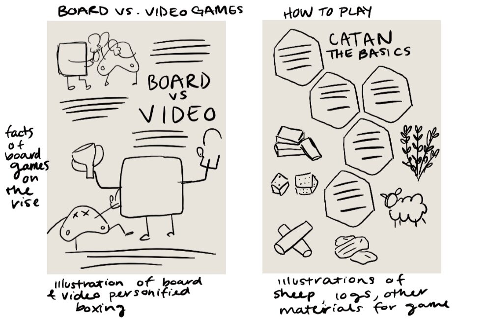
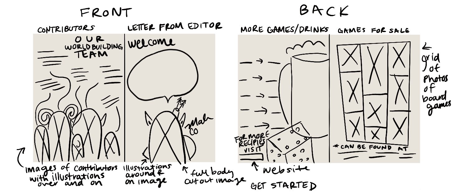
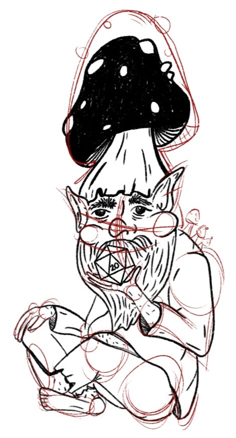
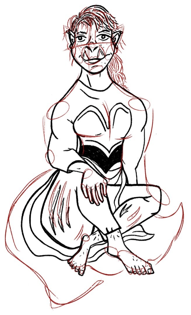
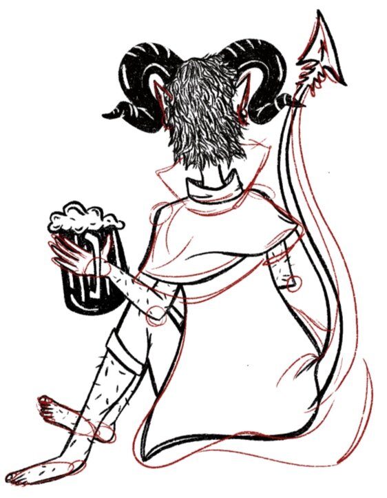
Once I was set on a logo and cover design I started on the magazine elements. I began by laying out every page with typography, leaving spaces for my own original illustrations on each page. Since I work better having a physical piece of paper and a pencil to sketch with I printed my magazine and began illustrating sketches around my type. I then pulled images of my sketches into procreate and traced over them to make them digital. Once that was done and I had an outline I would add the fine details and upload each as a png onto my InDesign file.
development:
Every illustration in my magazine was done by hand. They were all sketched either on paper or in procreate and imported into my magazine through pngs. The original illustrations were well worth it and added unique design elements to the magazine itself. As with every design process, the ideas, layout and type changed throughout the magazine multiple times until reaching the polished and unique final product.
Feature Article 1
Feature Article 2
